DESS Logo
Our Logo
Our logo includes both a symbol and a wordmark. They always work together and should never be separated. Use the one most appropriate for the space and layout.
Exceptions
In digital content, the service mark can be omitted. However, It is preferred for legal reasons to include terms and conditions somewhere on the page (where acceptable).Exterior signage can omit service marks. Promotional items do not require service marks. For any questions regarding logo trademark usage and terms & conditions, please reach out to the legal team.
Vertical Logo
Use this logo where the vertical arrangement is most appropriate for the space and layout. When the logo appears on dark-coloured backgrounds, the white wordmark is used.
Use the full-colour logo whenever possible. When it is not possible to use the full-colour version because of limited colour production, use the provided all-black or all-white versions of the logo. For more information see the Usage section below.
To ensure legibility of our logos, we’ve prescribed minimum size and clear space rules. All logos at right should follow these rules.


Clear Space & Minimum Size
Clear Space
To ensure its integrity and visibility, the logo should be kept clear from competing text, images, or graphics.
The logo must be surrounded by an adequate clear space. For the vertical logo, the clear space on all sides is, at minimum, equal to the height of the letters in the symbol.
Minimum Size
For the vertical logo, the width of the logo should never appear smaller than 1.5” in width when used in print materials, or 100 pixels in width when used in digital formats. If a smaller size is needed, refer to the special logo section, for a special lockup for small sizes.
Symbol
The symbol is rarely used on its own. It should almost always be used with the wordmark.
Some exceptions are social media avatars (in cases when our full company name is present), select promotional items or when used as an abstract pattern (in cases when our full company name or logo is present).
When using the symbol as an abstract pattern it should be scaled large to emphasise its form and accompanied by the full logo.
Usage
Full-Colour Logo
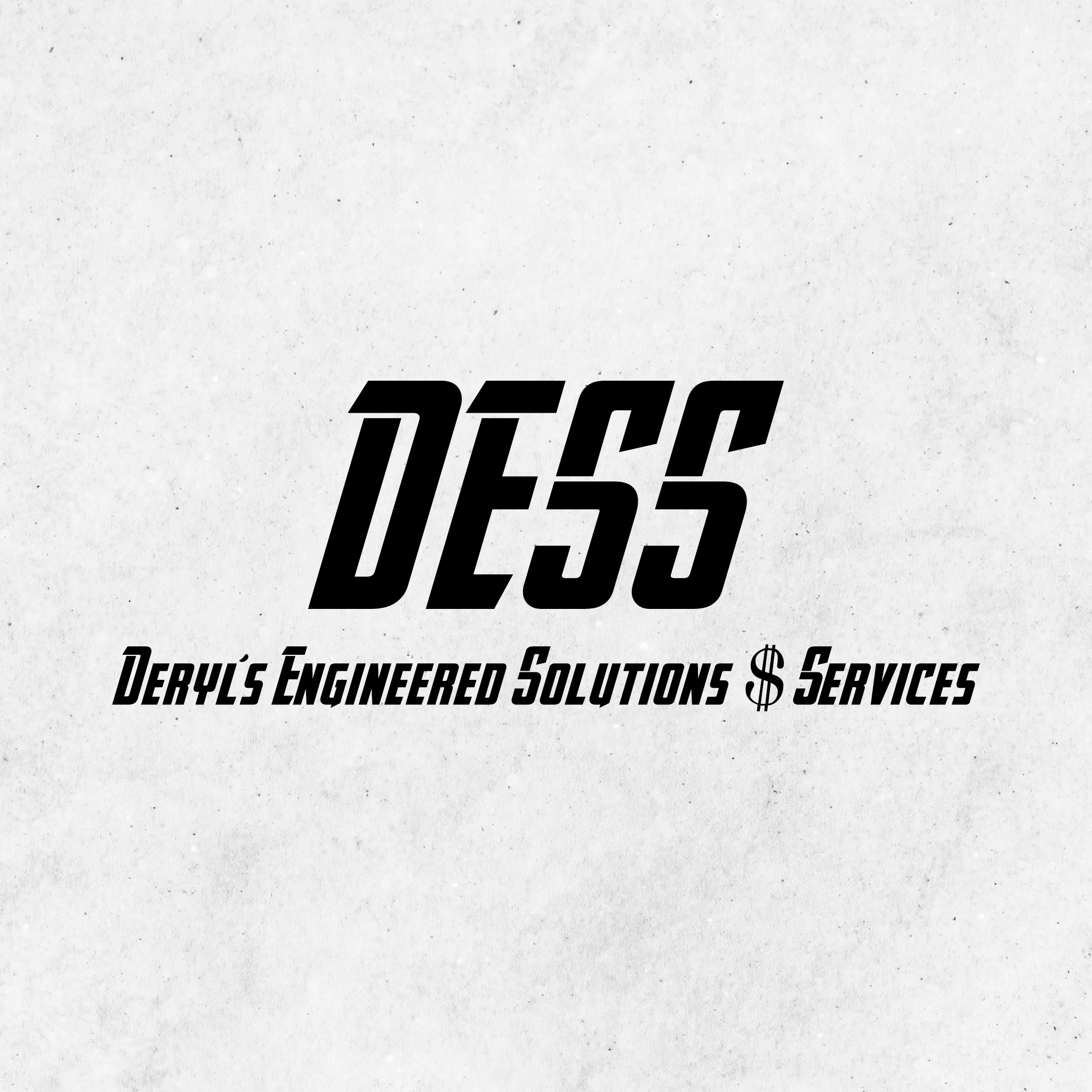
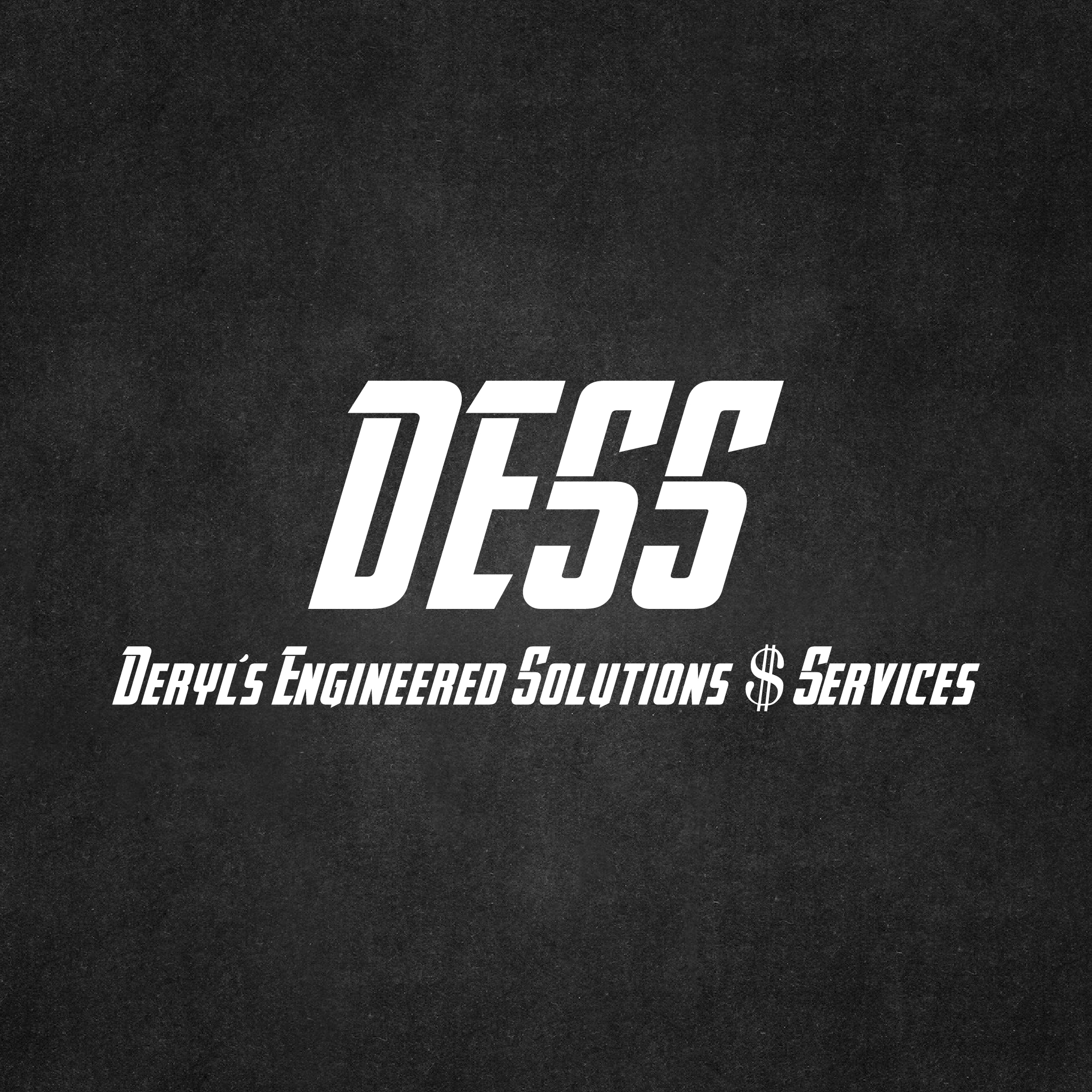
Use the full-colour versions of the logo wherever possible. Here we show examples of approved logo use on coloured backgrounds. When placing the logo on coloured backgrounds, make sure that the logo has sufficient contrast with the background to ensure visibility.
For maximum contrast, use the logo with the blue-coloured wordmark on light-coloured backgrounds (see top row). Use the logo with the white wordmark on dark-coloured backgrounds (see middle row).




Usage
Incorrect Usage
Use the logo correctly to maximize impact and consistency and to protect the value and integrity of our identity. Always reproduce the logo from original artwork files, and avoid improper logo usage.
These examples apply to all
