Contrast in Graphic Design: Mastering the Art of Visual Hierarchy
In less than a second, the human brain accumulates a massive amount of information from viewing a design composition. Unlike reading text, the eye is drawn to elements that stand out the most. This is why contrast in graphic design is significant; it determines whether a viewer will leave or explore further.
The Essence of Contrast in Graphic Design
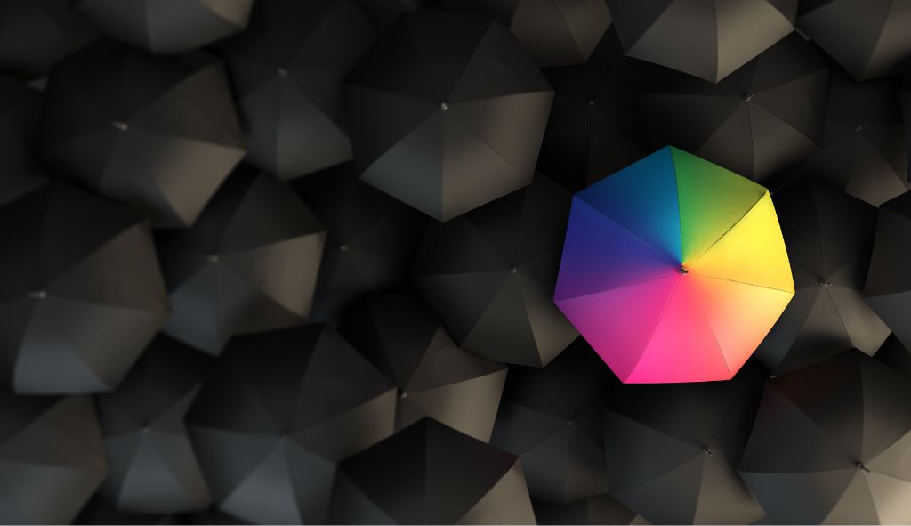
Contrast in graphic design refers to the visible difference in properties of design elements, drawing attention to particular areas. This difference should be significant enough to distinguish one element from another, making it easier for viewers to understand the design’s meaning. However, excessive contrast can overwhelm the senses, creating a chaotic appearance. The key is to balance similarity and contrast to set the stage for key elements.
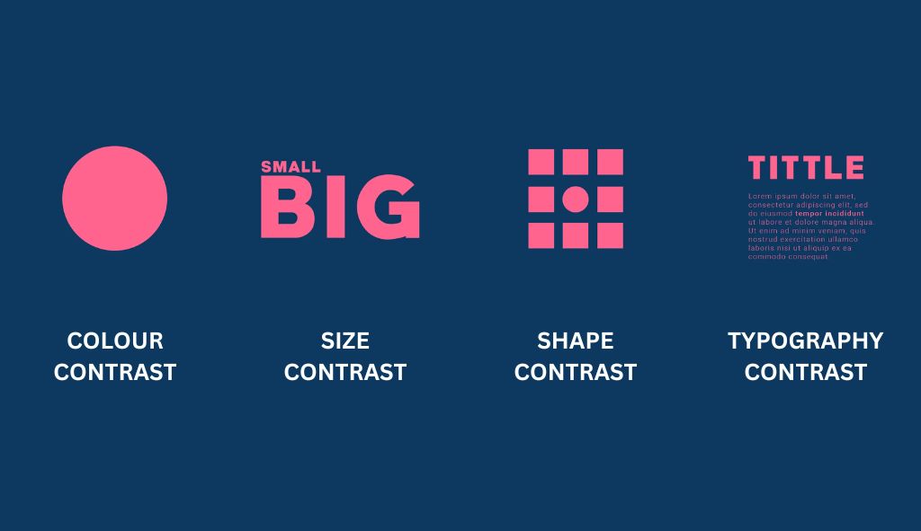
Colour Contrast: The Foundation of Visual Appeal
Colour contrast is one of the most fundamental principles in graphic design. The stark difference between a white background and black text is a basic example. Designers work with broader colour palettes, where contrasting colours should not clash but complement each other. Complementary colours, opposite on the colour wheel, provide a pleasing contrast while clashing colours can irritate the eye.
Size Contrast: Creating Visual Importance
Size contrast involves placing large objects or text blocks next to smaller ones. The eye naturally gravitates towards the larger element, interpreting it as more important. This technique is effective in creating visual interest, particularly in limited space. For example, a large headline beside smaller text emphasizes the headline’s importance.
Shape Contrast: Highlighting Key Elements
Shape contrast is achieved by introducing a noticeably different shape into a design. For instance, in a layout dominated by squares, a circle will draw immediate attention. This technique is effective in highlighting key messages. The human eye appreciates similarities but is intrigued by distinct differences, making shape contrast a powerful tool in design.
Typography Contrast: Enhancing Readability and Interest
Typography contrast involves using different typefaces, sizes, and styles. A design can use one or two typefaces and employ variations like light, regular, and bold styles to create contrast. Additionally, choosing colours that complement the overall scheme can make text sections stand out. This approach ensures textual elements are visually engaging and hierarchy is maintained.
Implementing Contrast in Graphic Design
Using contrast in graphic design requires a balanced approach to ensure the design is interesting and effectively communicates a message or call to action. Here’s how to use various types of contrast effectively:
1. Utilizing colour Contrast
To utilize colour contrast, select colours that stand out from each other but also harmonize. For example, a bright colour against a dark background creates a striking contrast. When designing, consider the emotional impact of colours. Warm colours like red and yellow can evoke energy and urgency, while cool colours like blue and green offer calmness and reliability. The goal is to guide the viewer’s eye to the most critical parts of the design.
2. Leveraging Size Contrast
Size contrast helps establish a visual hierarchy, making important elements more prominent. Use large fonts for headlines and smaller fonts for body text. Similarly, large images or graphics can serve as focal points. This contrast helps direct the viewer’s attention and makes the design more dynamic.
3. Applying Shape Contrast
Shape contrast can be used to create focal points. In a layout of predominantly rectangular shapes, introducing a circular or triangular element can catch the viewer’s eye. This technique is particularly useful for logos or call-to-action buttons, where immediate attention is desired. The contrast in shape not only highlights important elements but also adds visual variety to the design.
4. Integrating Typography Contrast
Typography contrast involves varying font styles, weights, and sizes. Using bold fonts for headlines and regular fonts for body text creates a clear distinction. Italicizing certain words or using different font colours can also highlight key points. This type of contrast ensures that the text is not only readable but also engaging.
The Importance of Balanced Contrast
Creating a visual point of interest through contrast in graphic design is crucial. Combining various contrast techniques yields optimal results. A balanced approach ensures the design captures attention without overwhelming the viewer. By strategically placing contrasting elements, designers can guide the viewer’s eye to the most important parts of the layout, enhancing the overall communication effectiveness.
Real-World Applications of Contrast in Graphic Design
1. Branding and Identity
Effective use of contrast in branding helps create memorable logos and brand materials. A well-designed logo uses contrast to stand out and convey the brand’s identity. For instance, the Nike swoosh and Apple’s bitten apple logo use simple shapes and contrasting colours to create strong visual identities.
2. Marketing Materials
In marketing materials such as brochures, posters, and ads, contrast is used to draw attention to key messages. High-contrast designs can make call-to-action elements like “Buy Now” buttons more noticeable, increasing conversion rates. Using contrasting colours and sizes helps important information stand out, making the material more engaging.
3. Web Design
Web design heavily relies on contrast to enhance user experience. Effective contrast between background and text ensures readability. The contrast in navigation elements helps users easily find their way around the website. Additionally, contrasting images and graphics make the website visually appealing and help convey the brand message effectively.
4. User Interface Design
In user interface (UI) design, contrast is essential for creating intuitive and user-friendly interfaces. Buttons, icons, and other interactive elements use contrast to indicate functionality and importance. High-contrast elements ensure that users can easily distinguish between different parts of the interface, improving usability.
5. Print Media
In print media, contrast helps make designs more striking and readable. Magazines, newspapers, and flyers use contrast in headlines, subheadings, and body text to create a visual hierarchy. This makes the content more accessible and engaging for readers.
Conclusion
Contrast in graphic design is a powerful tool that enhances visual interest, guides the viewer’s attention, and communicates messages effectively. By understanding and applying various types of contrast—colour, size, shape, and typography—designers can create compelling and dynamic compositions. Balancing these elements ensures that the design captures attention without overwhelming the viewer, making it a critical skill for any graphic designer.